Pull Your Socks Up
Lun3DM4 - Released for Quake 3 on April 10th, 2003
After shelving an ill-fated attempt at a Quake 3 single player mod, I decided put the wealth of leftover textures that project generated to work in a new deathmatch map. This one, I decided, would be different. I decided that I would cast off Quake 3 entirely in favor of making the map specifically for Challenge Pro-Mode, and that I would apply a new lesson for me at the time: testing gameplay and iterating on a series of blockouts before even considering a visual theme.
I started with a fairly standard Quake deathmatch layout of one big atrium and two little side atria, with added twists. One was a longer hallway connecting the two pods to form a danger zone for a powerup, and the other an intentional lack of physical connectivity made up for by prevalence of teleporters. I wanted to stop treating teleporters as a patched-in addition for connecting the opposite ends of the map and try to consider them an integral part of the layout, and even made some frightening pseudo-4D drawings showing how the teleporter connections would make the map behave like a conventional layout. It half-worked in the first blockout, but not well enough, and the constant feeling of running into dead-ends made the whole thing feel more claustrophobic than I was after.
At the urgings of my peers I took a sledgehammer to it and began to remove walls instead, until the distinction between "rooms" was all but destroyed. The large atrium became the area with the high jumppad and first rocket launcher, the long back hall turned into the area with the megahealth and second rocket launcher, and both absorbed the two side pods until the map became just so much interconnected space. The only hints of the old form were thick and evenly spaced off-center pillars. I would later give these special treatment visually, as massive anchors of the structure.
It was at this point I involved the CPMA crowd. I had decided long before starting this that if I made another deathmatch map I wouldn't even bother with vanilla Quake3, and just make a standalone CPMA map instead. I played pong with Joel 'wviperw' McDonald, tossing alphas to him and getting item and layout suggestions in return, like the narrow ledges around the periphery, making the megahealth well a dead-end (formerly stairs), and that wacky red armor teleport-to-nowhere.
One of CPMA's modifications is to greatly expand the set of trick jumps and alternate means of movement players can deploy to move around. Each one (air control, strafe-jumping or bunnyhopping, ramp-jumping, double-jumping, etc) has roots in some prior Quake title, often as physics bugs that became anointed as features by players who learned to exploit them. I treated each as a first-class feature, turning the entire map into a jungle-gym players can scramble and mantle and parkour across in a flash, and a player who knows the moves can gain altitude as easily as they can lose it, meaning the common trade of exchanging a height advantage for some other benefit, like an item, no longer applies here.
At one point the map had two BFGs (which CPMA transformed into a suped-up big brother of the rocket launcher, which was also suped-up) as an experiment with capturing the mad slaughterhouse feeling of Quakeworld, but this was way overboard in such an intimate space. Another unconventional item loadout choice which did stick was intentionally leaving out the railgun. The railgun would have disporportionately dominated in this level, with its wide open spaces and long sightlines.
When we ran out of ideas for things to fix, I hit the art phase.
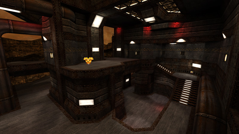
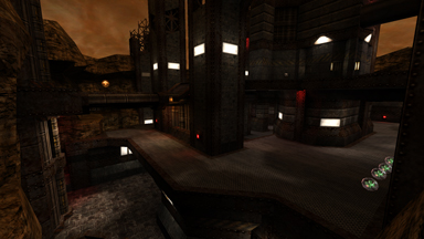
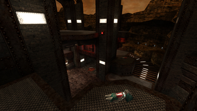
I had tons of textures in a similar vein to Coriolis Storm ready to go, and easily pulled off a theme that was kind of like a less invasive Lun3DM1 - still rusty and broken, just not so dry and hot. Crow sound effects lent the map an almost autumnal feeling instead.
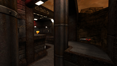
I put a lot of thought into 'disguising' the original layout, replacing alpha brushwork with rocky cliffs and giant pipes as often as metal and masonry. The result is a map that feels very serendipitous, that all the elements in this corner of a real world just happen to be so well suited for gameplay, rather than having been designed that way from the start.
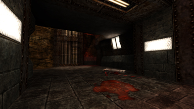
The lighting is something I'm less proud of, in retrospect. I wasn't yet adept at using broad fill lights to simulate bounced light, so coverage is contrasty and intense. Since I also didn't want light to appear to come from nowhere, the map is a spray of glowing panels and lamps that stand out far too strongly against the dark, decaying materials. Squint at any screenshot and count the white rectangles.
The CPMA crowd received the map well enough to include it in the official Promode distribution as CPM23. The lack of a railgun gave CPM23 a reputation in the tournament circuit as an oddball that favored lightning-gun-centric players, however, and wasn't often included in 'proper' competitions. This was disappointing, since I would think a tournament with a spread of unique levels that test players under a broad set of circumstances would be ideal, but this kind of resistance is what you can expect when you target a game mode that was created for players who felt that Quake 3: Arena was too new and different.
Play It
- Brushes: 1768
- Modes: Tourney, Free for All
- Players: 2-5, 2 strongly reccomended
- Filesize: 6.5MB
Local Download | FileFront Download | Fileplanet Download
Source .maps (released under the terms of the GPL)
