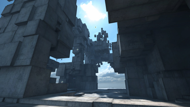
You'll Shoot Your Eye Out
Lun3DM5 - Released for Quake 3 on February 5th, 2012
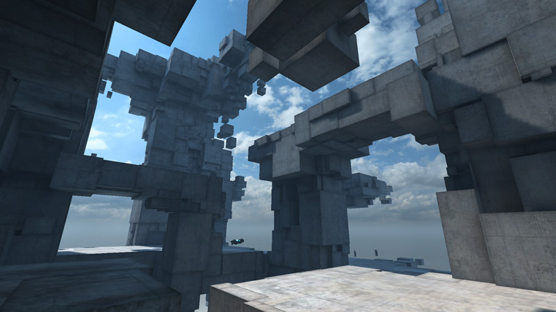
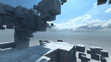
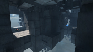
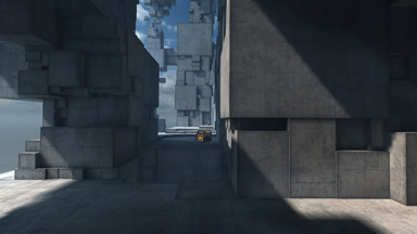
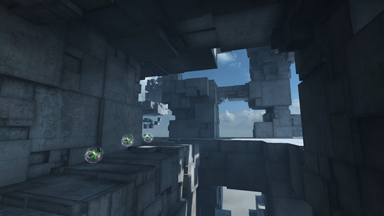
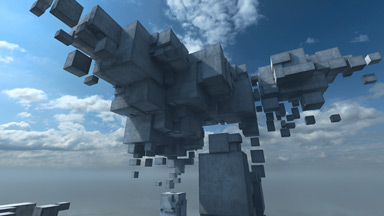
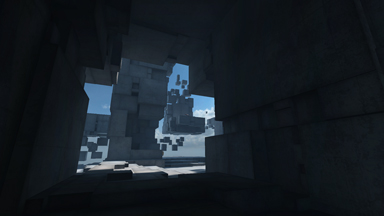
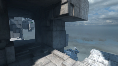
A blockout map is also pretty, in its way. When gussied up with gentle fog, soft omnidirectional lighting, and enough fractious post-brutalist geometry to lend the depth and texture that unfinished maps are lacking, without sacrificing the stark austerity that a map textured entirely in bare concrete must by nature embrace, it becomes prettier still. This is at least the working theory behind "You'll Shoot Your Eye Out."
A common way 3D artists show off a model in a demo reel turnaround is to render it untextured in grey matte, frosted with an ambient occlusion pass to softly elicit all the nice details. Even bad models can look pretty good this way, and I began to think about whether I could do the same thing to a Quake3 map. The cheap way to hack a global illumination pass without waking the Mental Ray kraken is to simply clone a dome of hundred or so dim, evenly spaced directional lights and enable shadows on all of them, which visually averages out to essentially the same thing ambient occlusion achieves with raytracing.
Sunlights in Quake3 are essentially directional lights, and Q3Map2 removed the one-sun limit, so with a similar dome array of suns and some properly balanced radiosity I felt I could achieve some very realistic lighting. The tools were there. But what to light?
Here Comes The Sun
At this point, I would feel I was stagnating as an artist if I were to return to both the Quake3 engine and to post-industrial rivets-and-masonry stylings. Lun3DM5 therefore provided a home for a number of ideas I had valued solely because they were against the grain, experimental, or just otherwise oddball.
Could I light an entire map with only the sky? I had the idea for the dome of suns, but could I rely on it entirely without needing a single point light? Such dome lighting works best when the entire object is in frame and the environment's color contributions are most obvious, so I would need to treat the level like such an object, surrounded by the infinitely larger environment of the sky. Thus the first requirement of the design was determined: it had to be a space map.
Could I get away with building an entire map with one texture? Not literally one shader - art direction eventually necessitated a number of entries - but even the geocomp maps used multiple tones and colors in their texturing for breakup and highlighting. The read of a scene's geometry is provided by both texture and light, which differentiate surfaces to provide depth and reveal contour, and I wanted to lean as heavily towards light as possible. Naturally there was nothing stopping me from releasing a map with no textures at all and one shader with a single $lightmap stage if I wanted to be confrontationally avant garde about it, but could I do it in a manner that players still found satisfying? The direction this ultimately took me was to attempt to bring modern architecture's love of bare poured concrete to the fantasy realm of Quake3, undecorated and unaccented.
Could I explore a more abstract, surreal theme? If I wanted this map to stand apart from my previous work, it was going to have to tell different stories. Rather than the tried and true real-world material tales of "this architectural feature broke and then fell here," I wanted to communicate the strangeness of another dimension and not just another rusty building. What makes the paintings of artists like Beksinski and Giger eerie, among other things, is that the worlds they paint follow their own rules. Sims's SAFE and the highly geometric (and also rather obviously global-illuminated) paintings of Peter Gric wound up providing the right inspiration. Their realistic realization of simple shape provided no other explanation for their existence other than "that's the way this dimension works," and I felt that attempting the same thing in the Quake3 engine was just enough of a reach to be possible.
Enter The Python
This provided the perfect excuse to scratch another itch of mine: to try generating the geometry of a map procedurally. The design itself would naturally still be hand-crafted (I'm not going to teach a computer how to design deathmatch levels), because procedural art is just fruity noise without the guidance of creative human decisions, but "texturing" every surface with irregularly sized, offset blocks was a perfect candidate for serialization.
This map would not exist without python. About 1200 lines were written to run within the python engine embedded in Maya, to take advantage of Maya's existing texturing and geometry tools. My earliest tests with lighting involved using python to sample the average pixel color of an ordinary quake3 sky environment cube around each of the 122 vertices of a face-poked fullerene, which were then dumped to text as q3map2 sunExt definitions. When paired with the actual sky in-game, it made even the plain blockout forms of my early test maps look strongly grounded in their environment, and immediately set them apart from anything else I'd seen in the engine. (Before YSYEO was released, I wound up employing this method on two other maps, Ludonarrative Dissonance and Don't Mess With Hexas.)
The bulk of the script, however, was responsible for disgorging the jumbled stacks of concrete blocks that make up 90% of the brushwork, nicknamed "cubespew," and the bulk of my development time went into developing it as well. (This is probably the first Quake3 map where most of the development time was not even spent in Radiant.) The script handles speedy generation of the cubey geometry, creates primitives out of them in Maya so I can preview and tweak before exporting to brushes (also with the script), and properly aligns and scales the texture on every face.
The early look tests revealed that the blocks all tended to blur together when they all had the same tiling concrete on them, so I made two large texture pages of every panel size between 8x8 and 320x320 to darken and dirty the edges of each block, and relied on the script to align every cube in the right place on the page with minimal scaling to keep texel density square and consistent. Even with the amount of time I spent writing, rewriting, and adding to the script, the investment was still a net gain: if I'd tried to build this map manually I'd still be far from finished.
(Re-)Implementation
This map would also not exist without Andrew Weldon. Actual level design was a bit farther from my mind for most of the project, but I still considered gameplay to be an important aspect of the medium. Rather than ignore it and create a static set piece, I enlisted the help of my long-time partner in crime to help develop a layout. I required of him only what I thought would best bring out the look I was developing: a space map, with soaring heights and towering forms, very open to the sky to maximize light transmission.
These turned out to be good ideas visually, and the first version of the map was looking absolutely amazing (better, I think, than the eventual release) and would have been very impressive indeed if it hadn't already annihilated all software that stood before it when it was only half-cubed. So it goes. I had to switch to the very latest netradiant-upgraded q3map2 to get around q3map's t-junction limit, then add -lomem just to keep the map compiling, but the sheer exponential increase in geometry was still bringing framerates down to the twenties in the troublesome spots, and this on a modern system. The soaring heights were just requiring too much geometry to cover, the openness just wasn't occluding enough, and the map itself was big enough for eight players comfortably.
Clearly we needed a new approach, one that favored technical limits first. Andrew drafted a completely new layout, with an eye to keeping it small enough for 2 players and blocking visibility more aggressively. I altered my approach as well, manually adding very large blocks and then cubing in the gaps around them, to cut down on geometry density.
The resulting performance is ... still a pendulum that swings wildly between "pretty good" and "playable," but honestly there's just no way we're starting this damned thing over a third time. It's an interesting test case in that it winds up stressing the CPU far harder than the GPU. Modern GPUs handle lots of triangles sharing one texture (the very image of this level) very well, but Quake3's need to touch every vert on the CPU every frame makes for a big bottleneck in roughly all the same cases and thus it simply doesn't scale well to crazy projects like this. However, the important thing is everyone learned a lot, and nobody got hurt.
Curiously, during the time I was making cubespew out of detail brushes in Quake3, Stéphane Malka was busy making it out of cardboard boxes in galleries in Barcelona and Moscow. His artist's statements are much artsier than mine.
Documentation | More information and screenshots at button-masher.net
Play It
- Brushes: 12,600 (11,400 detail brushes)
- Modes: Free for All, Tourney
- Players: 2-5
- Bots: No longer useless! Just moderately brain-dead. Be sure you have Version 2 of this file (Mar 18 2012).
- Filesize: 29.7MB
