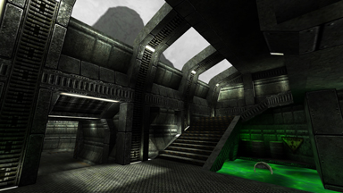
A Load of Useless Bloody Loonies
Lun3DM3 - Released for Quake 3 on June 18th, 2001
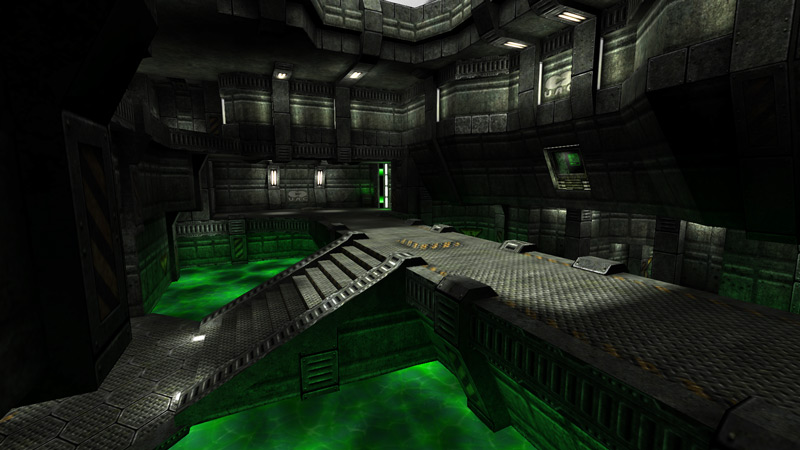
After losing a bit of time to ill-fated contract work, I began another deathmatch map/amalgam of borrowed inspiration: my favorite classic Doom thematic elements, my favorite classic Quake gameplay elements, and a lot of green, since I hadn't done that color yet. Pity the bots didn't like it. And that nobody played it.
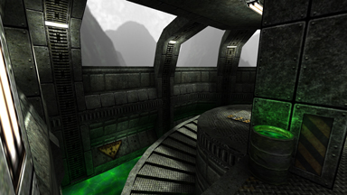
The great Carmack Doom3 .Plan Update Incident was still ringing loudly in the community's ears, and by the time common sentiment began changing shades from "omg awesome" to "this will never live up to expectations" I was already well underway with my own tribute. I spent a long time building Doom maps in DCK before Quake2 came along, and I developed an affinity for some of its textures, especially the style of Knee Deep in the Dead. The concrete walls with rounded extruded forms, hexagonal floor tiles, giant picture windows looking out on inappropriate but oh-so-characteristic foggy Andean skies, and of course toxic green NUKEAGE1 had all become essential trademarks of the look and feel of Doom, and with the news that id was bringing it all to modern tech, I couldn't help but want to play along.
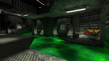
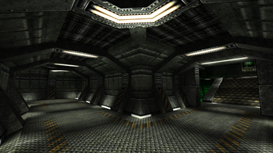
I fleshed out a set of pale olive green concrete walls to match and expand on good old reliable STARGRN*, requisite UAC insignia included, with a second set of less derivative dark metal panels and trim to hold it all in place. Requisite foggy Andean skybox came next, and mapmodels of the infamous exploding barrels (which don't actually explode for obvious reasons of technical limitation) came after. I even went so far as to include custom bot files that all used the Doom Marine player model, including new skins for each of them by Harlequin in the original four Doom multiplayer uniform colors, for an authentic batch of opponents. This may have been overdoing it.
At the same time, I went about my typical modus operandi of blocking the map in first, to have a playtested version of the final layout and proportions solidified when it came time to build the fancy stuff. I took heavy gameplay inspiration from Headshot and Danimal's Dapak: the tightly connected atrium-and-two-pods layout, use of teleporters as critical connective elements, and the approach of designing areas specifically around how the items they held would be made dangerous or disadvantageous to grab (such as the megahealth on the treacherous center cross or the grenade launcher in the lowest room of the map).
The pre-vis-to-final method worked as well as it always did, to a point. I was slowly becoming increasingly disenchanted with Quake3's gameplay - the more I played it the more it convinced me that design decisions had been made specifically to shallow the gameplay and reduce the importance of the "metagame" of prediction and control - and increasingly attracted to Challenge Pro-Mode, the self-importantly self-named mod that aimed to do the opposite. I asked Mr. Fribbles and xfoo to give the map a once-over to suggest what item changes would best suit CPMA, but unfortunately only after I'd done the art and lighting pass. They were quick to point out that there was a limit therefore to how much Promode could wring out of Lun3DM3. This would be a big influence in how I approached my next map.
Unfortunately, the day after I uploaded the finished product to my then-webhost fragland.net, someone DoS'ed them into the ground. For a month. That on top of my not having released anything or even being heard from for a year pretty much drowned any popularity this map could have had out of the gate.
Play It
- Brushes: 2850
- Modes: Free for All, Tourney
- Players: 2-6, 2-4 reccomended
- Filesize: 5.9MB
Local Download | PlanetQuake3.net Download | Filefront Download | Fileplanet Download
Source .maps (released under the terms of the GPL)
