Coriolis Storm
Lun3DM1 - Released for Quake 3 on April 10th, 2000
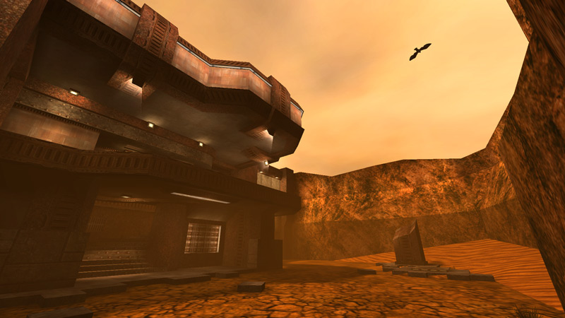
By far the map I'm most well known for, Coriolis Storm started one of its own when it was released. Metlslime's comment at QMap when I posted the very first screenshot (an early image of the western YA room) stating simply "Finish that map" gave me the encouragement to actually do so, and it's a good thing I did. The gameplay is fairly even and bland, but nobody seemed to care - the desert theme was original enough that this map made it to one of Computer Gaming World's cover disks (although the author would like to point out that he was never sent a copy, or even notified).
When Q3Test was released, I ran around it excitedly thinking about what I could do with the engine. 32 bit textures not bound by a palette, 2x default texture resolution, a multi-pass shader language: creative heaven. I bought Quake3 pretty much just to map for. For the first few months after its release, though, I barely saw any community mappers try to break out of reusing the game's existing cheese-goth art style.
The Starcraft expansion had been released some time prior, and I was taken by how the new desert tileset seemed more desert than desert - rich orange sands, corroded future-shanties made of corrugated tin and greasy tarps, and everywhere relics of a past human presence - so much so that I decided to try emulating it in Quake3.
I pulled together textures from every Q3 directory without regard to how they were originally meant to be used together, photoshopping some and creating others from scratch, until I had a nice palette of orange dirt, red rust, and brown stone. I had an existing map layout already done that I thought was great at the time, so I set about building it out, exploring the theme as I went. I focused attention on making the place seem old and formerly useful, but long since abandoned: stone tiles are missing from the floors, plants grow up through cracks, and drifts of sand have piled in the downwind corners.
The func_rotating bird was a last minute addition.
As you can probably tell, this level was an environment art project for me first, and a deathmatch level a distant second. I love the way the theme turned out, but I became less happy with the gameplay over time. Nearly every room is a rectangle fed by entrances high and low, and each of those entrances leads through a corridor to another such entrance in another such rectangle. I had also stuck to my baby theory that balance is best in deathmatch design, and that the level's job is to get out of the way. This precluded me from ever considering ways that players can use the design against their enemies, which is the meat of the deathmatch metagame; without that you're just firing rockets.
Play It
- Brushes: 3598
- Modes: Free for All, Teamplay
- Players: 3-8, 4-5 reccomended
- Filesize: 3.1MB
Local Download | PlanetQuake3.net | Filefront | 3DDownloads | Fileplanet
Source .maps (released under the terms of the GPL)


